2022
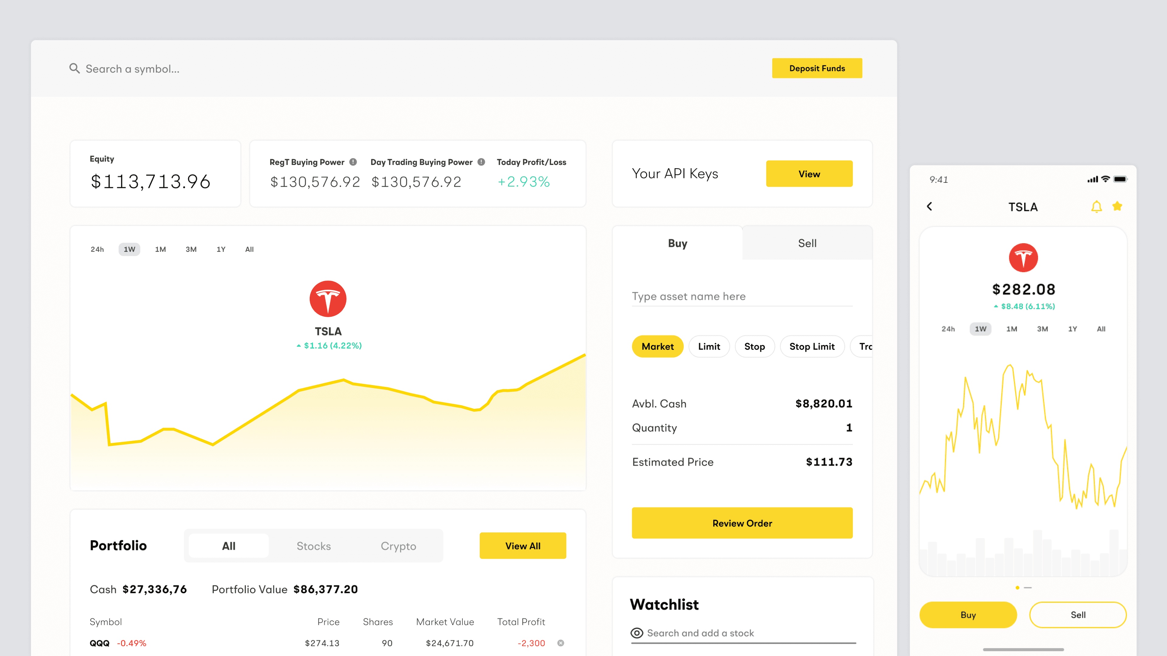
Alpaca Dashboard
A visual design revamp for better UI/UX.

Context
Alpaca's broker dashboard was functional but its design systems needed to reflect a maturity that gains user credibility as a secure & trustworthy broker.
Problem
Alpaca's broker dashboard was dense with information and inconsistent with various designs for a common component.
Role
Design Lead
Senior Visual Designer
Tools
UI/UX
Figma
Skills
Brand & Flows
Visual Design
UI
Components
UX
Information Hierarchy
Move tags for more
Solution
I helped improve information hierarchies, consistent component patterns, and refine the visual maturity of the product.
Process*
Fixing information hierarchies, updating UI for current trends, and refining the dashboard overall visual design.
*More to come for the case study.


Impact
This revamp was implemented as the face of our products on the hero section of the website's homepage for businesses & users to better understand our offerings. Unfortunately, my time at Alpaca ended before I was able to see its impact in production.
Explore more