2023-2024
Docker.com
Designing webpages for the #1 Most-Used Developer Tool.
Problem
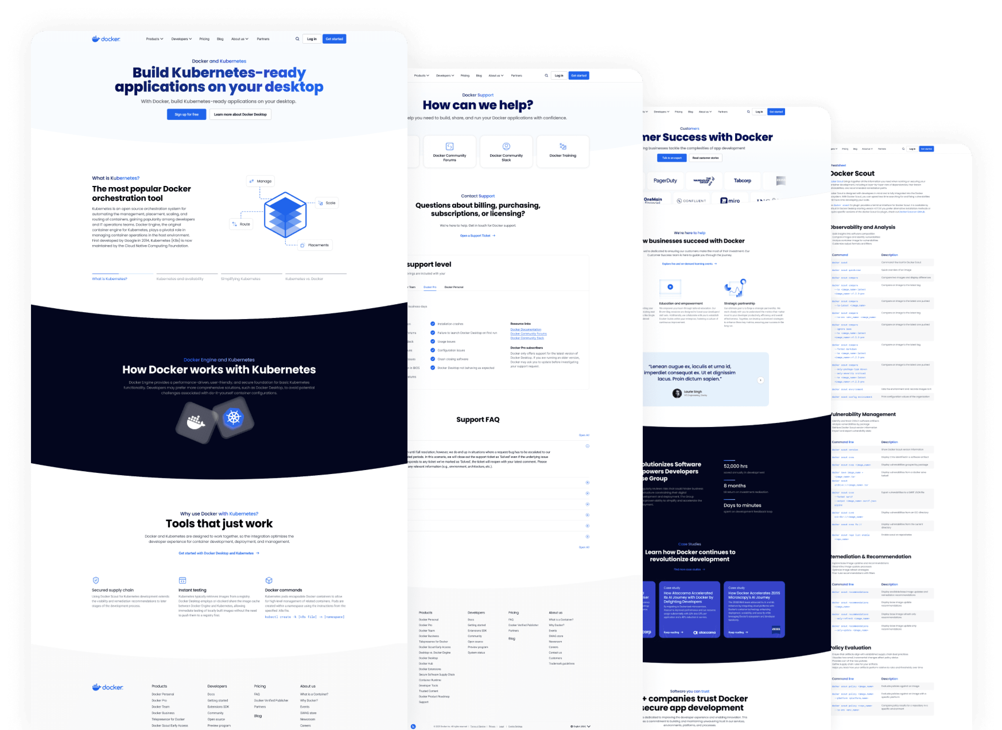
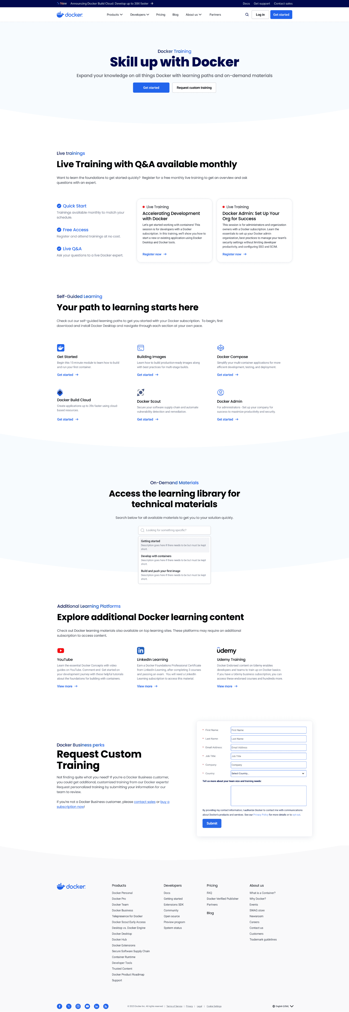
Docker’s website was dated with old style guides, content, and inconsistent UI/UX. The company was known for its containerization technology but aimed to reposition as a multi-product offering Suite of Development Tools.
The old layouts were also dense with paragraphs, unclear call to actions, and inconsistent tone and voice. This made it hard for users to digest content and quickly find what they're looking for, let alone understand Docker's fullest offerings.
Solution
The team focused on product storytelling and rebuilt components, website architectures, and webpages to create better user flows, interactions, and content engagement.

Approach
Wireframes were created to agree upon a general direction to fix the website's structure. Webpage templates were then established and foundational components, style guides, and modules were created and implemented to revamp Docker.com.

Design decisions
The design team decided to leverage the Docker blue & grey colours from the product design systems for the global website colors.
We kept Poppins, Roboto, and Roboto mono from the old style guides, but were implemented conservatively and with intentionality.
Finally, basic base modules and reusable components were established to build consistency, scalability, and a refined website identity.


Results
95% of Docker's website was successfully revamped, improving user experience and clarifying Docker's product positioning.
I collaborated with content designers, SEO-specialists, product teams, and web developers to 30% of Docker.com's webpages from concept to creation. This includes, but is not limited to, the following pages:
Customer Success
Customer Stories
Docker Training
Resources
Kubernetes Solutions
Case Studies
Support
Heatmaps indicate an average of a successful 1.8 CTA clicks/session and analytics are monitored for continuous improvements to our users' experiences.


Explore more

